Adding color to your home is a great way to display your personal style and add some vibrancy to a space. Choosing a color palette, though? House color schemes are almost endless, and that alone can overwhelm some homeowners and cause commitment issues.
With expert advice and a few tried-and-true tips, though, you can make your home feel like it just got a custom makeover.
Choosing the Right Color Scheme for Your Home’s Interior
Homeowners should first understand that color is more than simply a shade on a wall, says Rachel Perls, an architectural color consultant and oil painter in the San Francisco Bay area. “We are affected by color on such deep levels. It’s biological and cultural. It can bring about a feeling of nostalgia or a strong emotion.”
When thinking about house color schemes, consider what kind of emotion you want to feel in a particular space. Picking a palette is more about the vibe the color elicits than the look itself.
Some homeowners are influenced by the color of the year chosen by paint companies or Pantone when they're picking paint for their own walls. Keep in mind that Pantone choices are influenced by a variety of industries and products, so they aren't based exclusively on interior design. If you want to test out a trendy color, you might start with a home decor accessory or two before going committing your walls to that shade.
Apply Color Basics to Your House Color Scheme
Before choosing a house color scheme, it’s important to know the basics of color theory. Three methods of measuring color reign supreme:
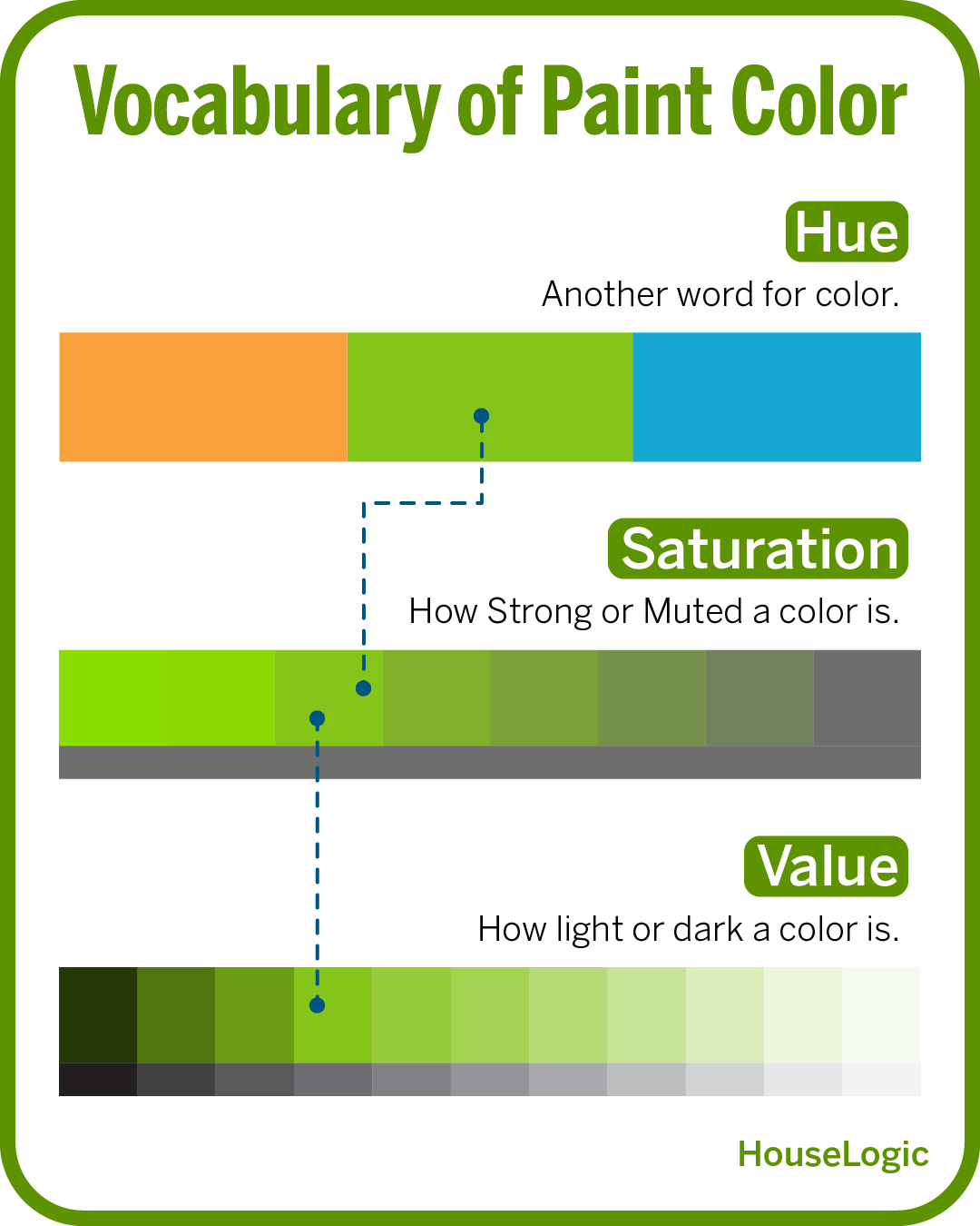
- Hue – Another word for color. Hues refer to color categories, which are typically known as primary, secondary, and tertiary. For instance, blue, red, and yellow are primary colors, while green and purple are secondary colors.
- Saturation – How strong or muted a color comes through. For example, a < sunflower yellow is highly saturated, while a pastel yellow is lower on the saturation scale.
- Value – How light or dark a color is. With royal blue, for instance, you can and add white to lighten it or black to darken the shade.
Choose Between Cool or Warm (and We Don't Mean Temperature!)
It’s also important to understand cool and warm tones for colors, Perls says. Many believe blues and greens are cool colors and yellows and reds are warm colors. But there’s a warm and a cool tone for every color, she explains. The terms “warm” or “cool” actually refer to the undertone of a color.
Undertone is a little nuanced. Popular paint brand, Sherwin-Williams, defines undertone as one of two main components of a color, the other of which is mass tone. “The mass tone is easy to see because it’s the overall color of the chip itself. The undertone, on the other hand, can be more difficult to spot because it’s the paint hue’s underlying color — the subtle difference that distinguishes it from similar hues in its color family.”
“I like to think that colors have personalities,” says Erica Dike, principal designer at Erica Ooh Designs. “Warm tones create a cozy and inviting atmosphere. Cool tones are calm and refreshing. Knowing the experience you want to create in your space will help you narrow this down.”
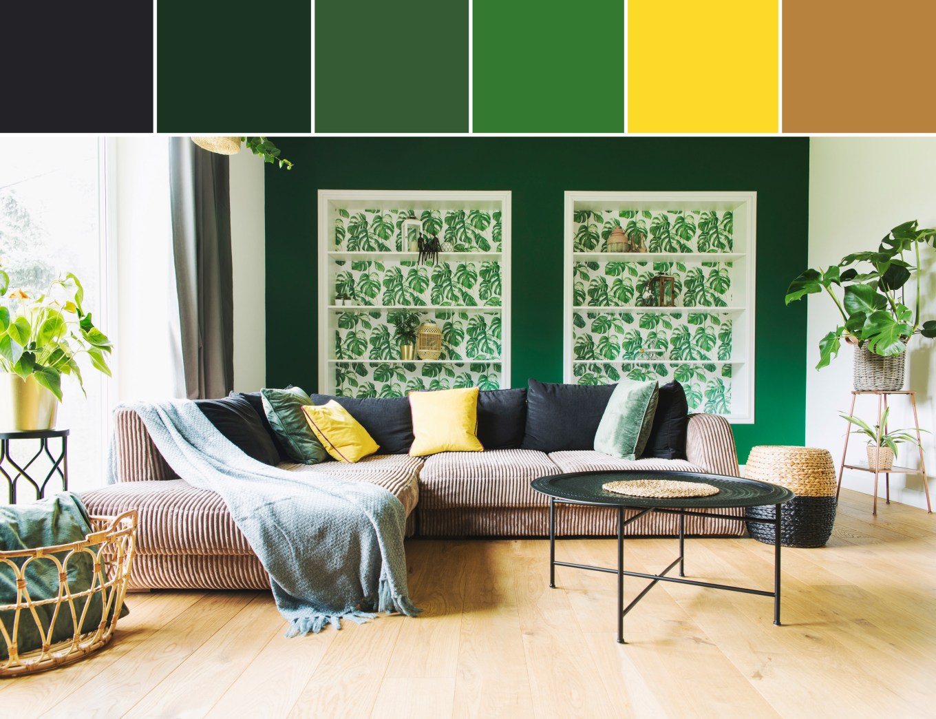
Figure Out Your Interior Design Style
Which comes first, the color palette or the interior design style? It’s true that some iconic style choices have a telltale color palette, but personal style is usually much more nuanced.
“The reality is that everyone has their own unique style within the guidelines of the wider known styles,” says Dike. “Your home is a curated space of the things you like based on how you use your home and how you want it to feel.”
If you’re stuck trying to figure out your personal style, check out your favorite home retailers, suggests Diana Hathaway, color expert at thegorgeouscolor.com.. “Crate and Barrel and West Elm are more contemporary, while Pottery Barn is more traditional,” she says, noting that most retailers have consistent color palettes. “That’ll usually give you a clue into what colors you may want to choose.”
Here are styles and the colors that might work with them:
- Midcentury modern – Orange and red, bright turquoise, olive green. “Think Frank Lloyd Wright,” says Perls. “You’re looking for high saturation.”
- Historic Victorian – Muted, muddier colors characterize the Victorian look. Examples include mauve, sage green, and steely gray-greens or blues.
- Craftsman – “Think all things fall,” Like burnt orange, brick red, warm browns and yellow ochres, Perls says.
- Contemporary – “This is a clean look without being too stark,” says Hathaway. A neutral color palette with a pop of vibrancy works well. Examples would be warm grays and beiges accented by emerald green or navy blue.
- Modern – “Stark and minimalist with defined lines,” is how Hathaway describes the modern palette. It’s cooler than contemporary, with blue-toned grays and whites working well.
- Traditional – Warm, inviting, and classic, this the color palette typically includes muted tones like sea green and butter yellow, along with navy blue and various warm beige hues.
- Bohemian – with a focus on the natural, the Bohemian style encompasses a neutral, muted palette, but loves a good pop of color. Imagine earth tones like sea green and beige with a pop of a vibrant color, like turquoise.
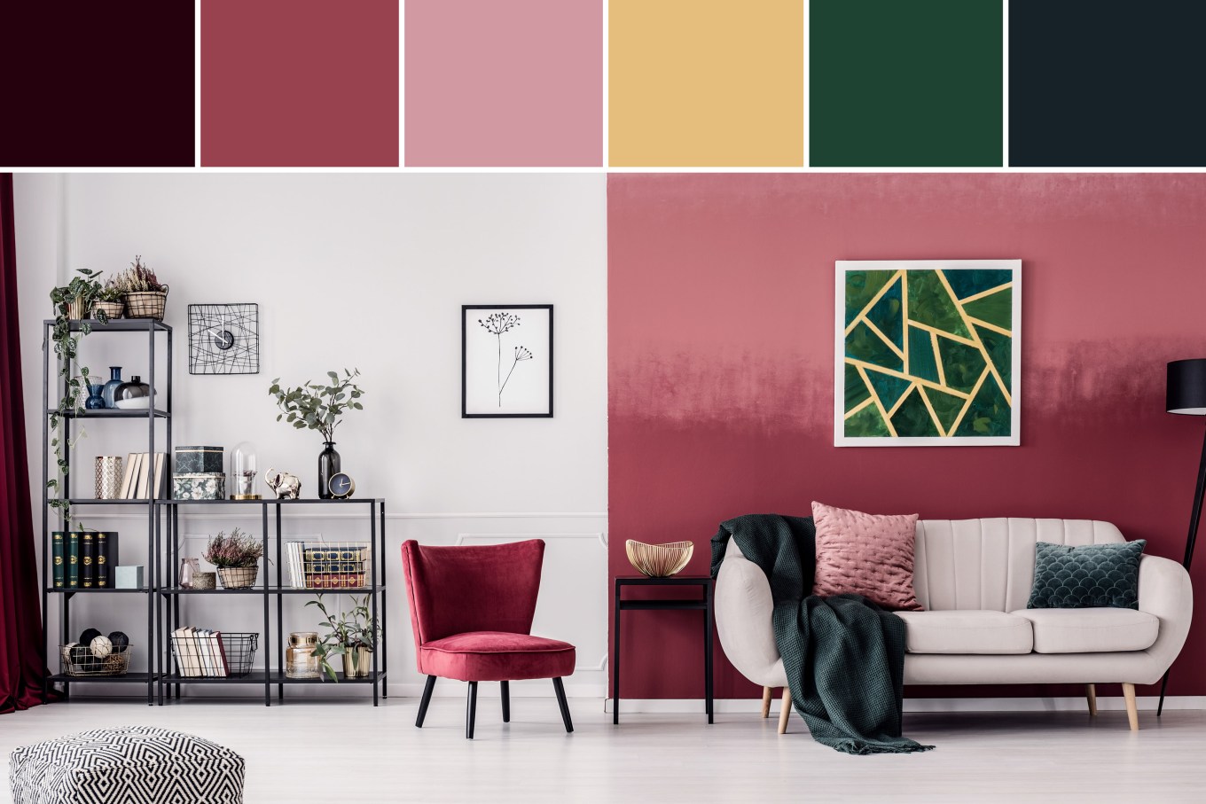
- Art Deco – this popular style flashback is all about the bold or bright, balanced with a few muted tones. Picture peacock green set against antique rose pink.
Working With Your Chosen Palette in Your House Color Scheme
Once you’ve decided on a style and palette, it’s time to get to work. Before settling on specific shades and hues, though, keep these tips in mind.
Test Out Colors
Test, test, test, say our experts. You might love a color in the store but find it clashes with the floors or the lighting at home. Test your colors in their desired spaces before you commit.
Technology isn’t great for this, says Hathaway, because colors always look different from the screen to the wall. She recommends painting large swatches of at least three colors and making sure there’s a white border around them to get a feel for the true color. Then, put those samples right up against the wall.
Perls recommends painting large 18x20 inch pieces of cardboard with two coats of the paint samples to get a proper feel for how the color will convey in your home. Prop paint chips up on furniture to see how things will look together, she says.
Dike recommends a resource called Samplize, where you can order paint samples from different brands. They’re 9 inches by 14.75 inches and offer a peel-and-stick backing so you can adhere them right to the wall.
Digital apps are available that let you virtually paint your walls using your laptop, tablet, or phone. Most of the major paint companies offer their own version of the tool, sometimes called an online paint visualizer, each with different features. A common feature allows you to match a paint color to an object or image. Experts recommend using the apps in combination with physical swatches in your home because both methods have some limitations.
Consider the Size of the Room
Once you’ve determined the style and color palette, you want to think about the size of your rooms. “Colors can manipulate the perceived size of a space. If you have a space that you want to feel larger and airier, you probably want lighter tones,” says Dike. “Darker or warmer tones will make a room feel more intimate or small”
Think About How Light Hits Color
Have you ever been in a room with an accent wall, and it appeared one color in the morning’s natural light and another color at dusk? That’s because of color cast caused by the light bulbs, says Perls. Light bulbs come in varying shades of white and brightness, which can affect the way a color looks in a room. That’s why Perls suggests only using natural light when choosing colors. “Natural lighting conditions gives you the truest form of the color.”
Once you’ve found a color you like, though, it is important to test it out under different lighting conditions. “The least expensive thing to change is your light bulbs,” says Hathaway. “Experiment with different light bulbs. There are so many variations of light nowadays, and smart light bulbs make anything possible.”
Factor in the Color of Your Furniture
Many people want to incorporate favorite furniture pieces, or accent or heirloom pieces into a house color scheme or style. An antique from your great-grandmother doesn’t have to be a deal breaker if you want a contemporary or midcentury style, says Dike. “I love working with older pieces, and I use the rule of threes,” she adds. For example, if you already have a living room set that’s gray, add two more colors through paint or accents. Or, if you have a favorite rug that’s one color and a couch that’s another, bring in a complementary color to balance everything out.
Look at the undertone of the furniture, Perls recommends. “Whatever the color of the furniture is, consider that part of your palette. For example, if you have a warm, reddish brown leather couch, decide if you want to accentuate the couch with a color that has a cooler tone or blend it in with a tone within the couch’s color family.”
Hathaway believes in neutrals and accents when working with already existing color. “If you want to change the paint color, you can keep it neutral without being boring. there are exciting neutrals out there.
“Accent walls are a great way to invigorate a room,” Hathaway continues. “I know people are saying they’re dead, but they aren’t. People still love them.” Adding in accessories to match new paint works well, too, she says. If you choose to bring color in through accents, choose more than one item. “If you only choose one item, it looks like you just picked up something on sale at HomeGoods.” Citing the rule of threes once again, Hathaway advises choosing three items that are the same color to pull it through a room in an intentional way.
House Color Schemes by Room
When choosing colors for individual rooms, Perls, Dike, and Hathaway agree that function and feeling are more important than the colors themselves. You might want calm and focus in your home office, but comfy and friendly in your living space. Keep those factors in mind when choosing. You also want to think about the times of day the spaces will be used the most, since colors look different depending on the lighting.
In spaces like a bathroom or a kitchen, where you might be working with existing elements, consider the tile, flooring, or countertop when choosing a color. Perls and Hathaway recommend light, cool colors in bathrooms to evoke an air of clean and calm. Seafoam green or powder blue come to mind. Dike, on the other hand, loves to go all out with color in a bathroom. “That’s where you can experiment with funky prints and bold colors or tile choices.”

Choosing a House Color Scheme for an Open Floor Plan
You might have a specific color goal for each room, but if you have an open floor plan, you might have trouble seeing how the vision will come together.
Choose one color, pattern, or texture from your chosen palette and style that acts as an anchor, Dike suggests. “That way when you step back, your eye immediately pulls that element into cohesion. In an open floor plan, I love to do this through accessories, like rugs. I like to pull a color from the rug in the living room and then use that color as curtains in the dining room, for example.”
Perls also suggests pulling one color through the entirety of the space. The color of an accent wall in a living space can double as the color of the backsplash tiles in the kitchen.
Don’t Be Afraid to Test Your Favorites

What if you love a color that’s not part of your design choice? What if you want to add in an accent color that doesn’t quite match? “You don’t have to be a purist with this,” Perls says. “Absolutely have fun with it.”
Remember that color is so much more than a shade on a wall. “Choose to live vibrantly through color,” Dike says.